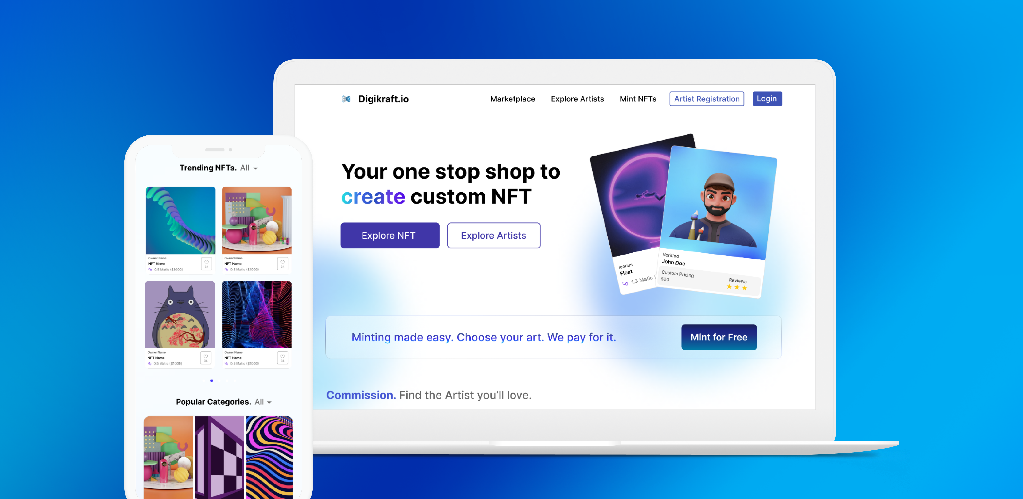
For Summer 2022, I joined Digikraft.io, a start-up in the Web3 space, as the lead UX engineer. I initiated revamping the bootstrapped webpage to a fully integrated and responsive website. I focused on ensuring users' convenient navigation and the elegant design that is in line with current trends.
Visit Digikraft.io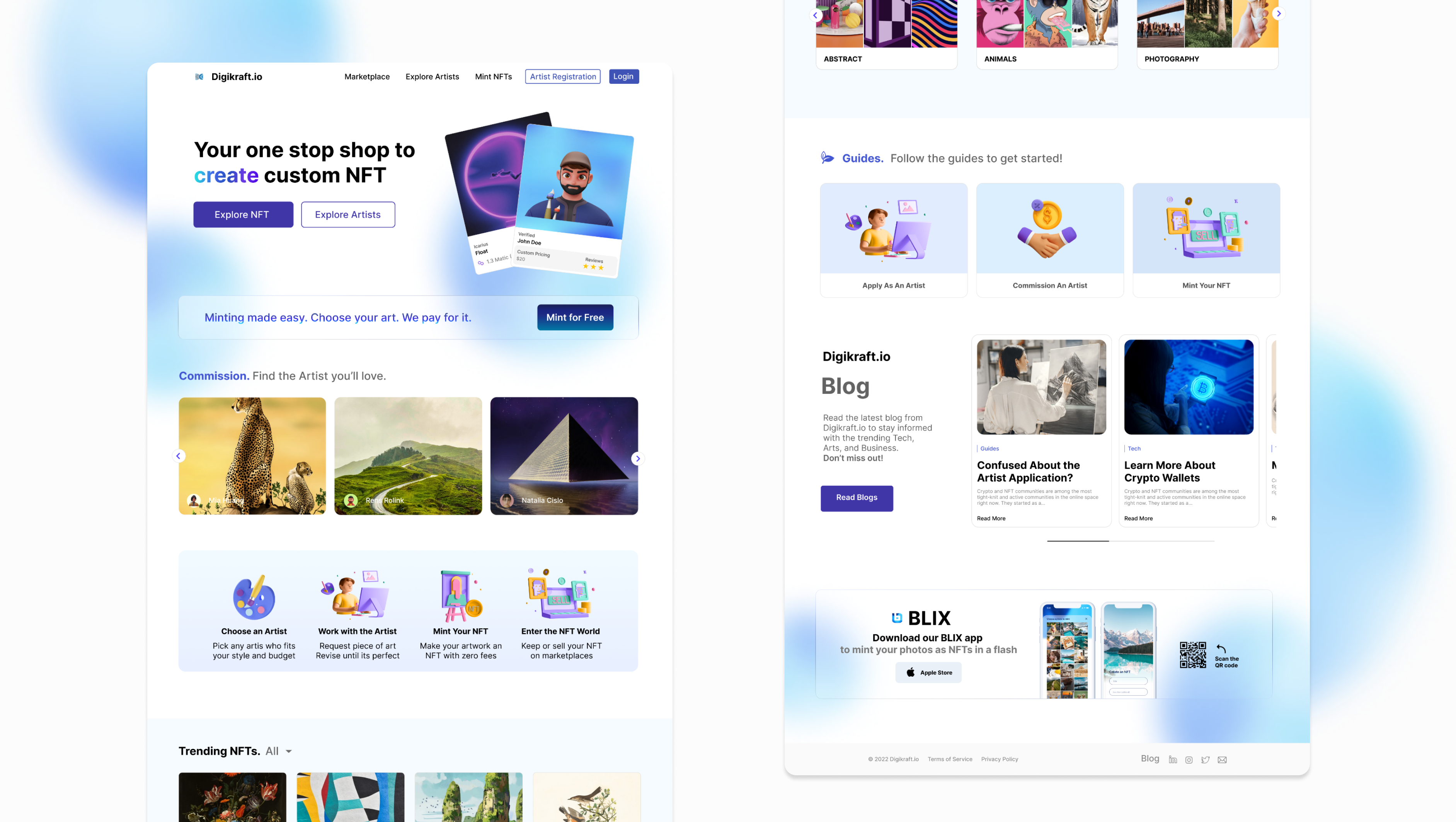
The NFT market is now worth more than $40 billion, and valuations keep rising. However, there exists an entrance barrier for non-artists to enter this lucrative NFT art market. Digikraft.io provides solution by providing an all-in-one marketplace where anyone can commission artists to create, mint, and sell NFTs all at one stop. It helps digital artists to expand their businesses, simultaneously helping non-artists to enter the NFT art world.
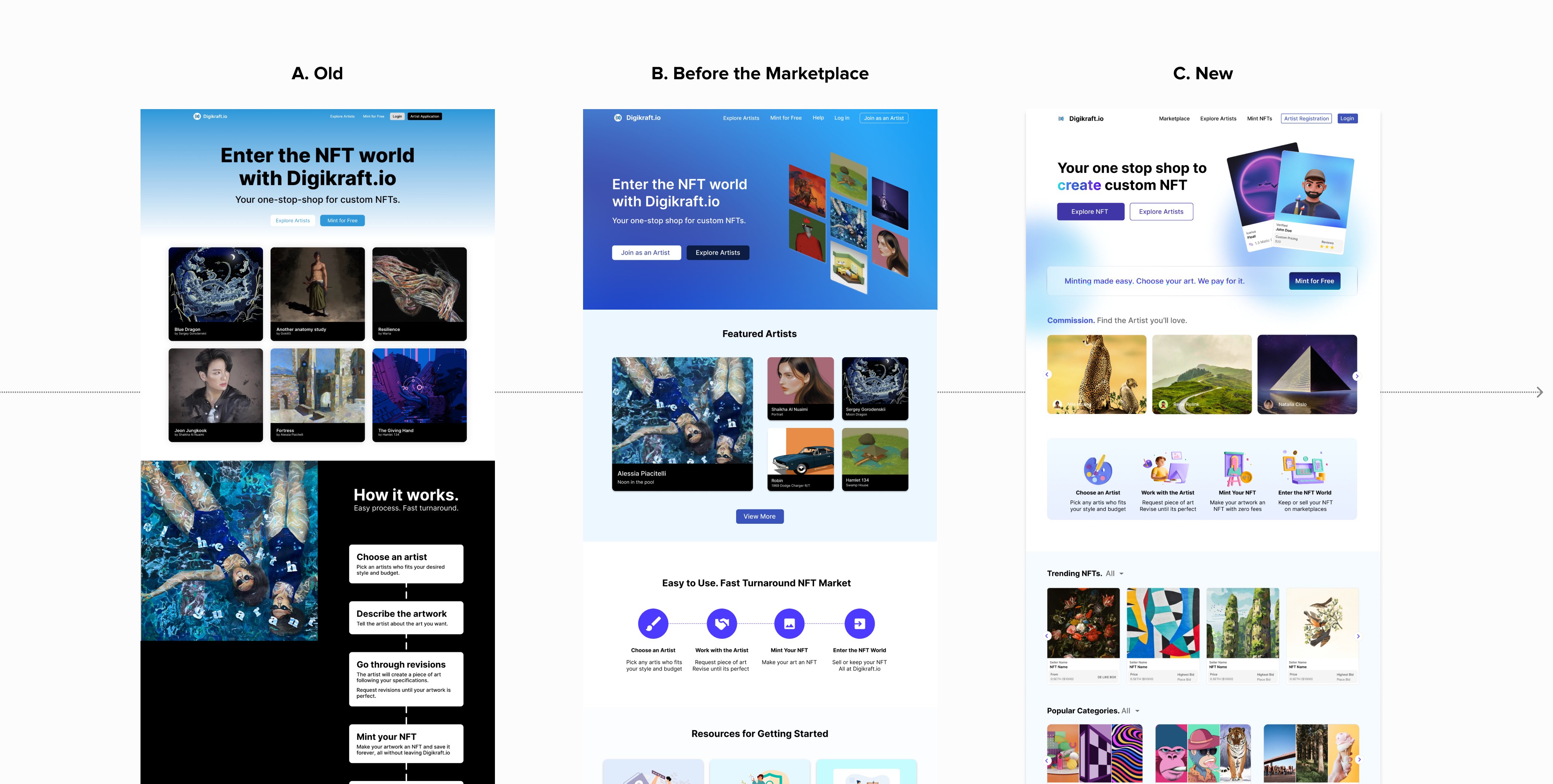


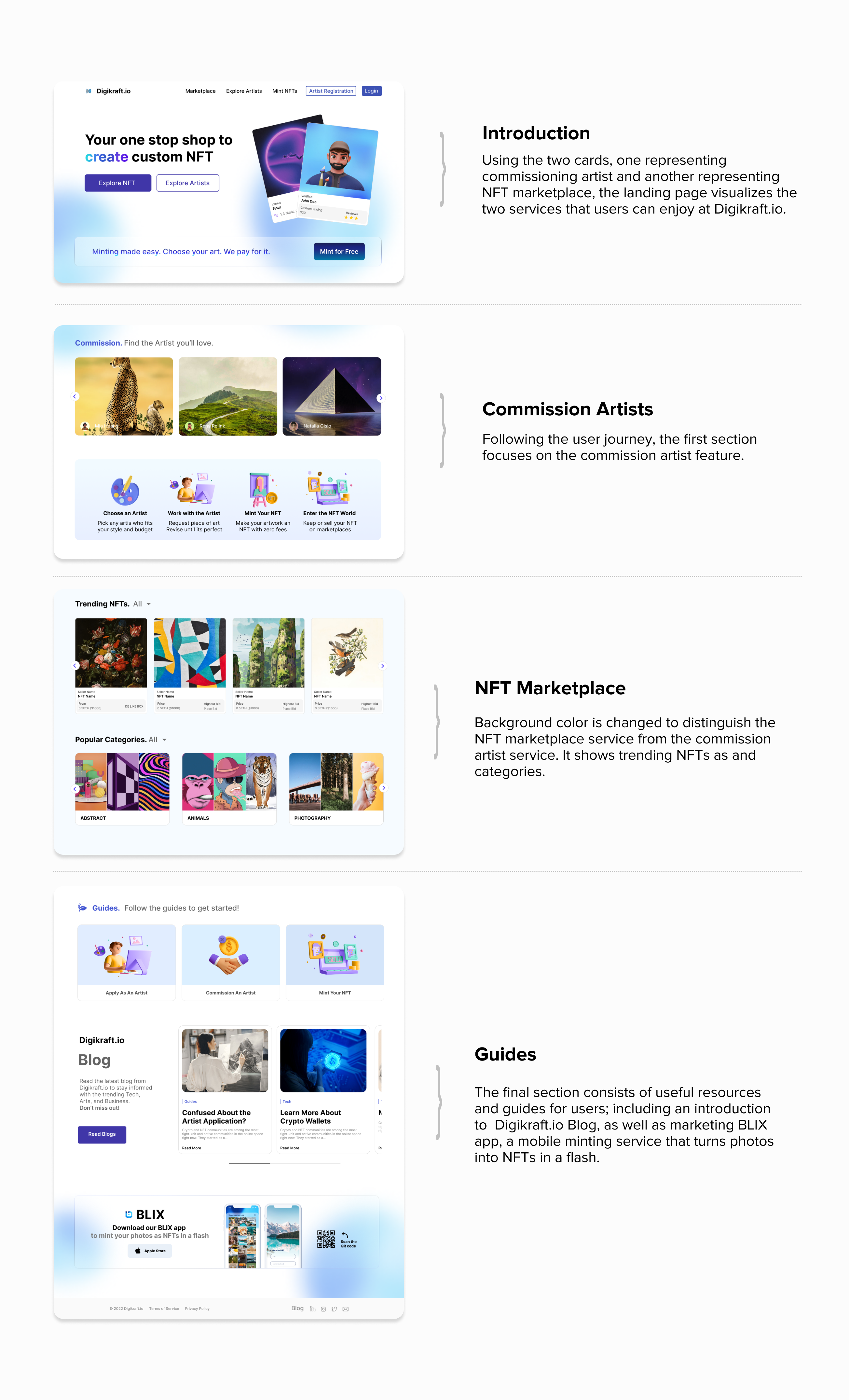
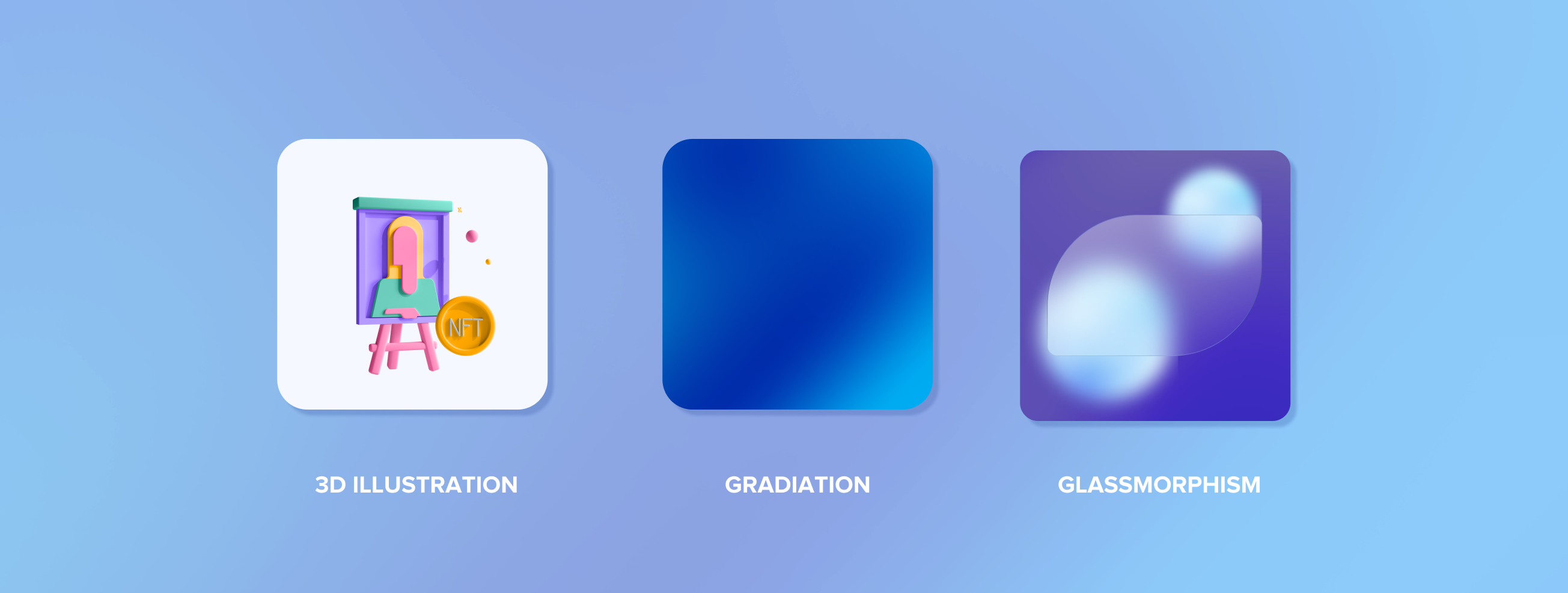
When building a design system, I focused on aesthetic and playful design to target young customers. For example, using cards to introduce the two-folds business - commission artists and NFT marketplace. Using 3D icons and Glassmorphism, I effectively added dimensionality to the web. Using gradation that is in line with the trends, the landing page is designed to optimize the user engagement.
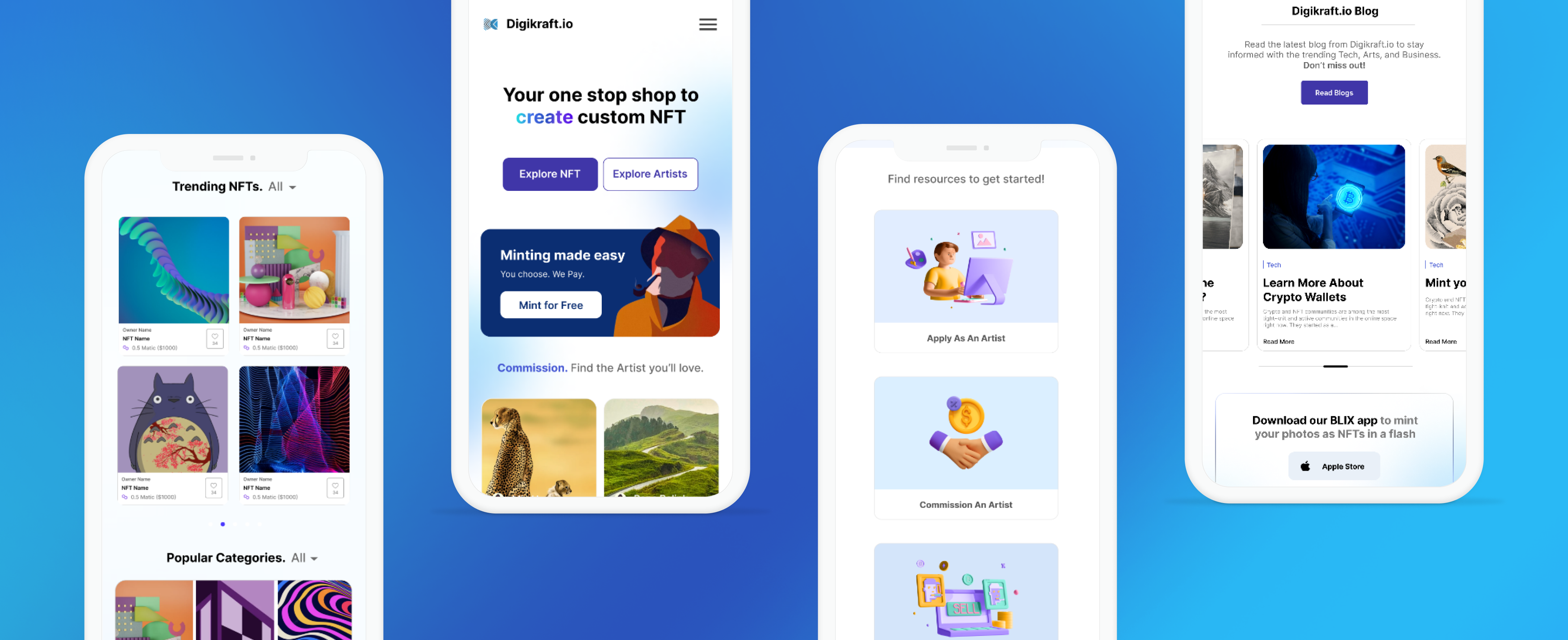
Making Digikraft.io accessible to any and every user was crucial. Using react-responsive, I was able to easily build a responsive web-app but also re-designed specific elements to optimize the user experience on devices with smaller screens.
Seek For Feedback
As a lead designer, I had an opportunity to take ownership of the design. However, I always asked for feedback and constructive criticism to ensure that the work is in alignment with business and company values.
Competitive Benchmarking
Researching competitors in the market allowed me to create a web-experience that is familiar for users to navigate but also unique to Digikraft.io. Knowing that NFT Marketplace is not a new service, but Digikraft.io's service that allows customers to create, mint, and sell NFTs by commissioning artists is a unique business. Therefore, through this competitive analysis, I was able to design a website that appeals to its strengths.