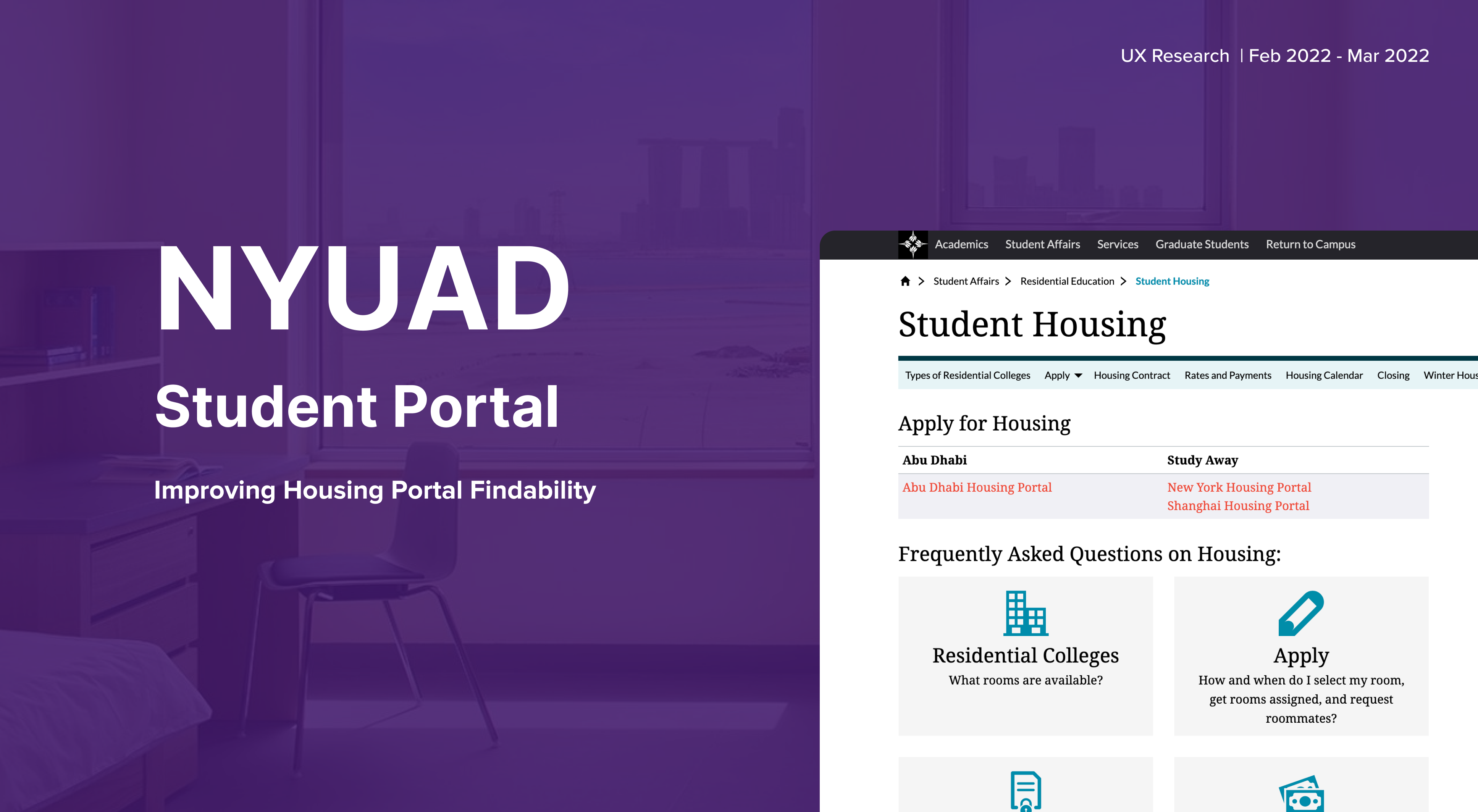
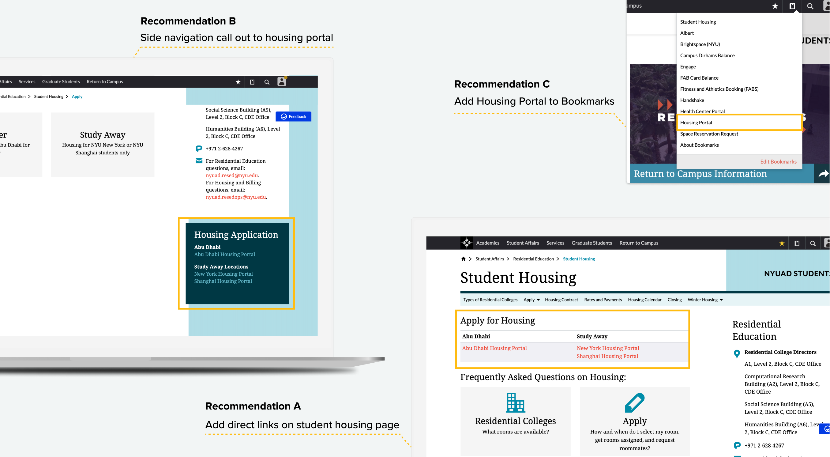
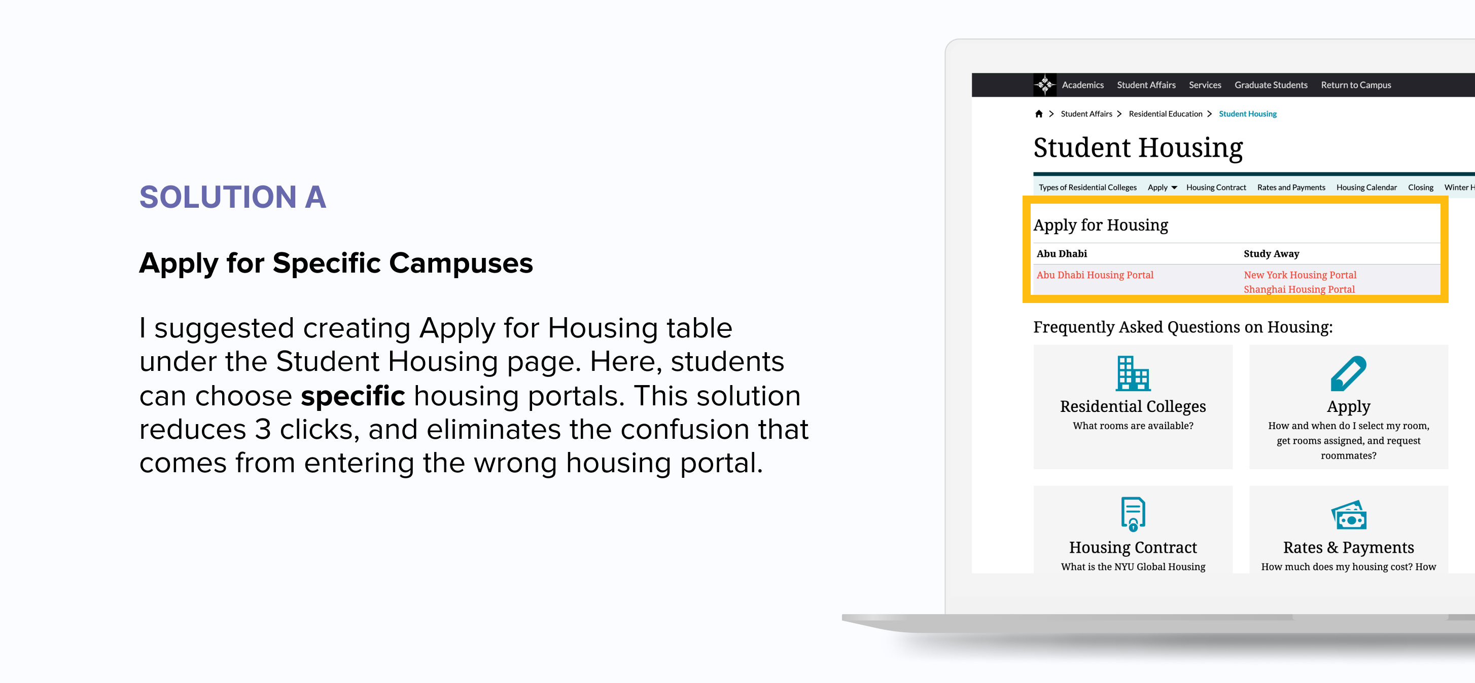
Every semester, NYU Abu Dhabi students struggle to find a Housing Portal when applying for housing. After conducting a user testing, I made UX recommendations to make the housing portal more easily accessible to NYUAD students.
I gave 8 students (2 students per each year) a simple task to, ‘apply for housing for the next semester’. All the participants were given with the student portal homepage, and they were observed in completing the tasks.
On average it took 4 minutes for students to reach the right Housing Portal, where they can apply for housing at the city they will be studying at.
Two main user flows were identified:
1. Use Navigation Bar
Student Portal > Student Affairs > Residential Education > Student Housing > Apply > Continuing Student Housing > Housing Portal > Access Application
2. Use Search Box
Using the Search Box to search ( # housing #housing application #apply for housing), followed by Housing Portal > Access Application

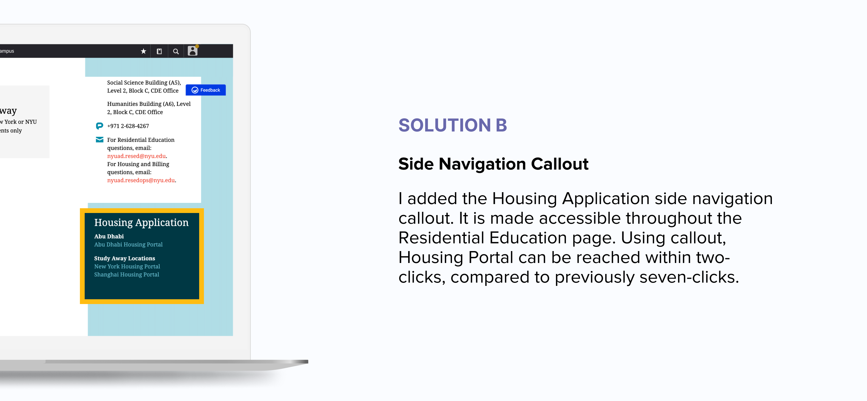
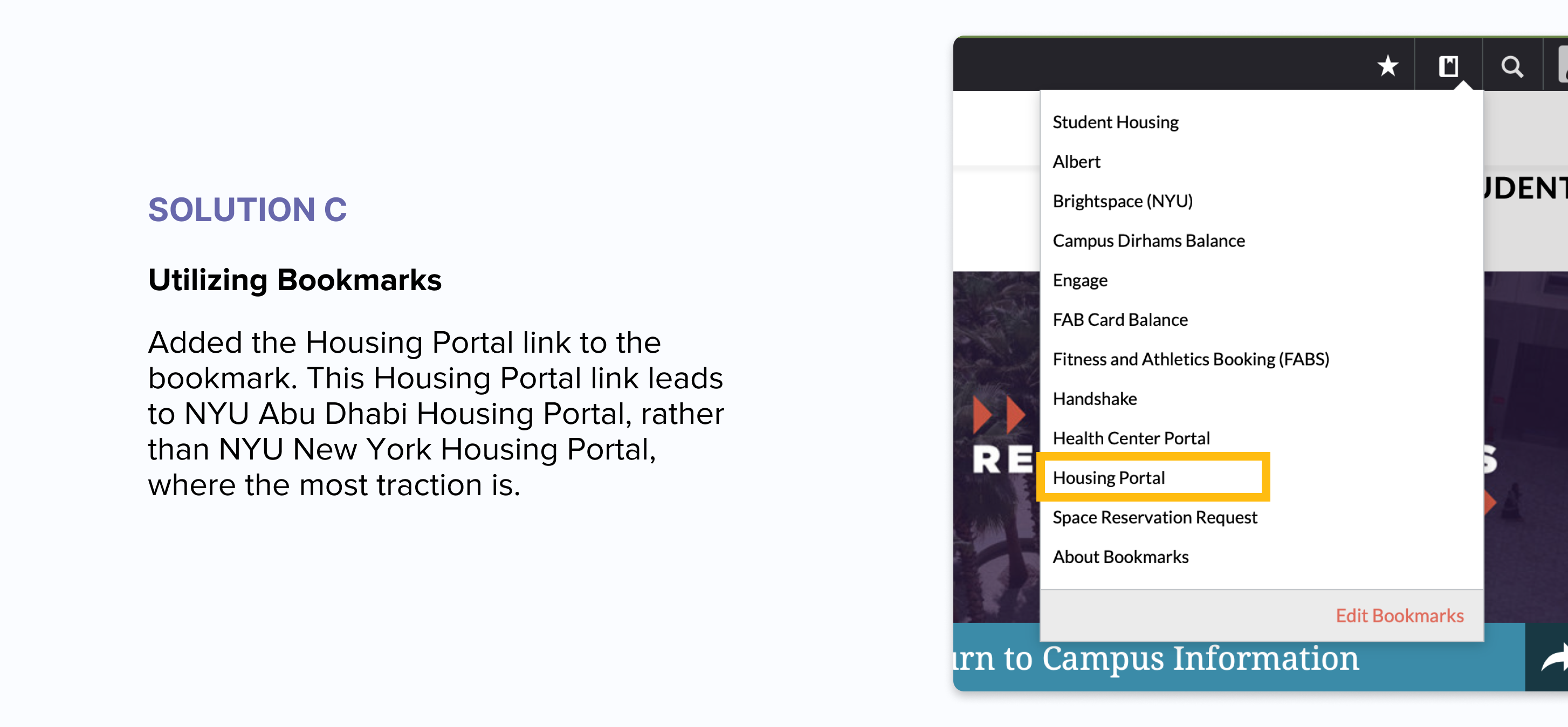
OUTCOME
Once the UX recommendations were implemented, I conducted another user test to find out if the changes have improved the Housing Portal findability. On average, students spent 2 minutes less (from initially 4 minutes) to reach the Housing Portal from the Student Portal.
TALKING TO THE STAKEHOLDERS
To execute this UX recommendations, I had to meet many stakeholders including the director of the Residential Education team, the web-content manager, and the developers. By presenting the problem supported by the data from the user test, and visualising solutions using mockups, I was able to convince the stakeholders and implement the changes swiftly.